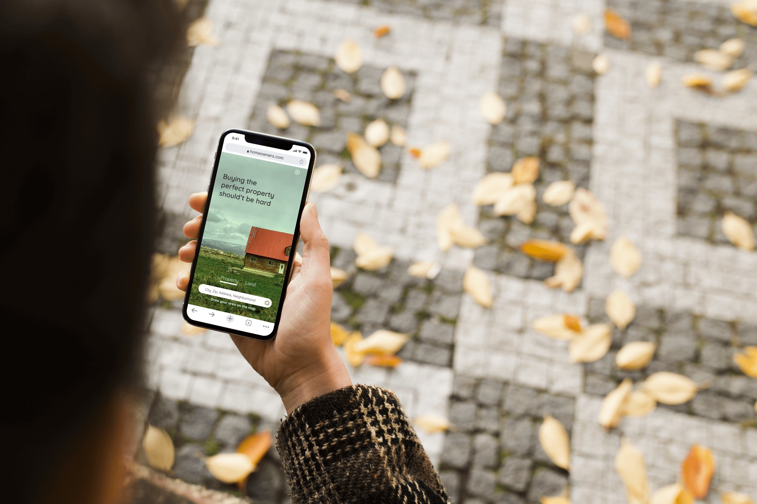
Home Owners
A responsive web app that provides property buyers with information on properties of interest
My role
Sole UX/UI designer
Tools
Figma, Usability Hub, Pen and Paper
Client
Student project at CareerFoundry
Timeline
01/23 - 03/23 (2 mos)
Introduction
Home Owners, formerly Perfect Properties, was one of four projects available as part of the UI specialisation at Career Foundry. Taking on this challenge pushed me to enhance my skills and deliverables as a UI designer.
Challenge
Real estate investment is an increasingly popular way for individuals to achieve financial security. It is an exciting and emotional experience, but often complicated. Wile there are plenty of blogs and agencies providing information, often buyers new to the market struggle to get started without professional guidance and waste time viewing properties out of their range. This app will provide them with the expertise they need to get started efficiently.
Proposed Solution
Create a mobile-first responsive app, that provides new small scale property buyers with information on potential property and land investment
Design process
Discover
〰️
Discover 〰️
In my role as UI Designer, as part of a design thinking model, the research typically performed during the Discovery phase had already been completed, with deliverables including user stories and feature requirements. These deliverables allowed me to empathise and gain key insights into the potential target user group.
Ideate
〰️
Ideate 〰️
Based on the information given I created the persona. Understanding the persona needs and pain points allowed me to emphasise and gain key insights into the potential target user group.
Persona
User flows & stories
User story #1
As a user, I want to be able to contact the right people if I am interested in viewing a property, so that I schedule a viewing
User story #2
As a user, I want to be able to search and filter properties, so that I can find good matches based on my needs
User story #3
As a user, I want to create a profile containing all my property criteria, so that I am recommended results most relevant to me and save the favourites for later
Wireframes
Low-fidelity
The next step of the process involved sketching low-fidelity wireframes to conceptualise the functions of the application stablished by the persona and user flows, before adding more detail and time.
Mid-fidelity
After establishing the key functionalities, I created mid-fidelity wireframes in Figma to add UI elements and design principles, and ideate on responsive breakpoints and grid layouts.
Refine
〰️
Refine 〰️
Mood board
The mood board will give direction to the visual design of the application moving onto high fidelity. I was heavily influenced by the use of colour theory and the ability to influence emotions. I choose as primary colour a tile read and wooden floor colours that inspire materials used in a house building.
Style guides
Test
〰️
Test 〰️
Usability test
Usability test wasn't required for this project, however I wanted to test my ideas with real users to create a product that satisfies users needs. I conducted 5 moderated usability testing, both in person and remote I focused on applying filters to their search, book an online tour and bookmark a property.
Input was classified as observations, negative and positive quotes and errors on a Rainbow Spreadsheet. The errors were rated according to Jakob Nielsen’s 5 Components of Usability. The top 5 issues are taken as the starting point of the next iteration.
Results
Insights
Little cosmetic issues
Missing some properties characteristics users may find interesting
Minor issues
Users want a side-by-side comparison feature
Missing a sort by button on property listing and some category filters
Users would like to save or share a property after
scroll down the whole screen
Users would like to extend the search radius on their searches
Features & functionalities
Some screen missed back button
Some unclear CTA
Navigation
Users expect to know more when booking a tour
Too much information on landing page
User want more explanation when are requested to create and account
Flows

Responsive design
〰️
Responsive design 〰️
Final mockups
〰️
Final mockups 〰️
User story #1
As a user, I want to be able to contact the right people if I am interested in viewing a property, so that I schedule a viewing
User story #2
As a user, I want to be able to search and filter properties, so that I can find good matches based on my needs.
User story #3
As a user, I want to create a profile containing all my property criteria, so that I am recommended results most relevant to me and save the favourites for later
Key takeaways
〰️
Key takeaways 〰️
This UI project was a very rewarding process for me, being able to work extensively on ideation, visual design languages and UI patterns. Using my skills in communication and effective feedback I quickly built good relationship with my mentor to fully benefit from their knowledge.
This is how I imagine the users of Homeowners after having found the house of their dreams through the application
A very positive experience during the process was to perform a usability test even if it wasn't required, it helped me to improve user satisfaction by incorporating the proper perspectives into the final design. On this project, I will continue to refine my user interface skills with daily UI design challenges and continue to develop my UI motion capability and integrate it into my projects.
Next step, I would like to continue building on responsive frameworks and develop desktop and tablet wireframes into high-fidelity prototype with strong visual and design principles, guidelines and accessibility to keep learning new skills. As well, I would like to design the land information to satisfy user needs given on the project brief. Ideally, I would love this product is in the market to be able to measure and quantify performance and success rate to keep iterating and improving Homeowners.


